Dusenberry-River Library
The purpose of this project was to redesign the Dusenberry-River Library's visual identity and wayfinding system. The existing identity and signage made it difficult for users to identify the library and navigate its different sections. The goal was to create a clearer, more cohesive visual system that would improve recognition and wayfinding throughout the library.
Brand Identity & Wayfinding System
Tools: Adobe Illustrator, Adobe Photoshop
Year
2026
Research
I visited the library and observed the environment for an hour to better understand how users interacted with the space. I examined the existing logo and identified areas where it could be improved, including its visual complexity and communication of the library's purpose. I also considered the different sections of the library and researched visual ways to represent them through pictograms. No signage for each of the library sections. The library’s sign outside was hard to find.
Audience
The primary audience was library users and visitors who need to identify the library, locate different sections, and navigate the space. Because wayfinding needs to be understood quickly, the visual system needed to be clear, recognizable, and consistent.
Concepts
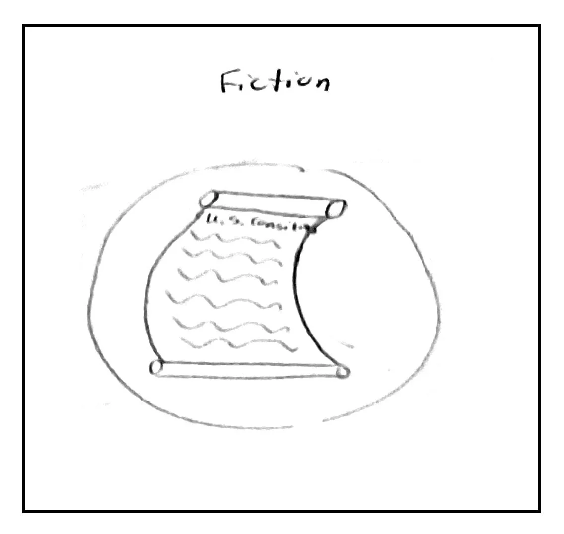
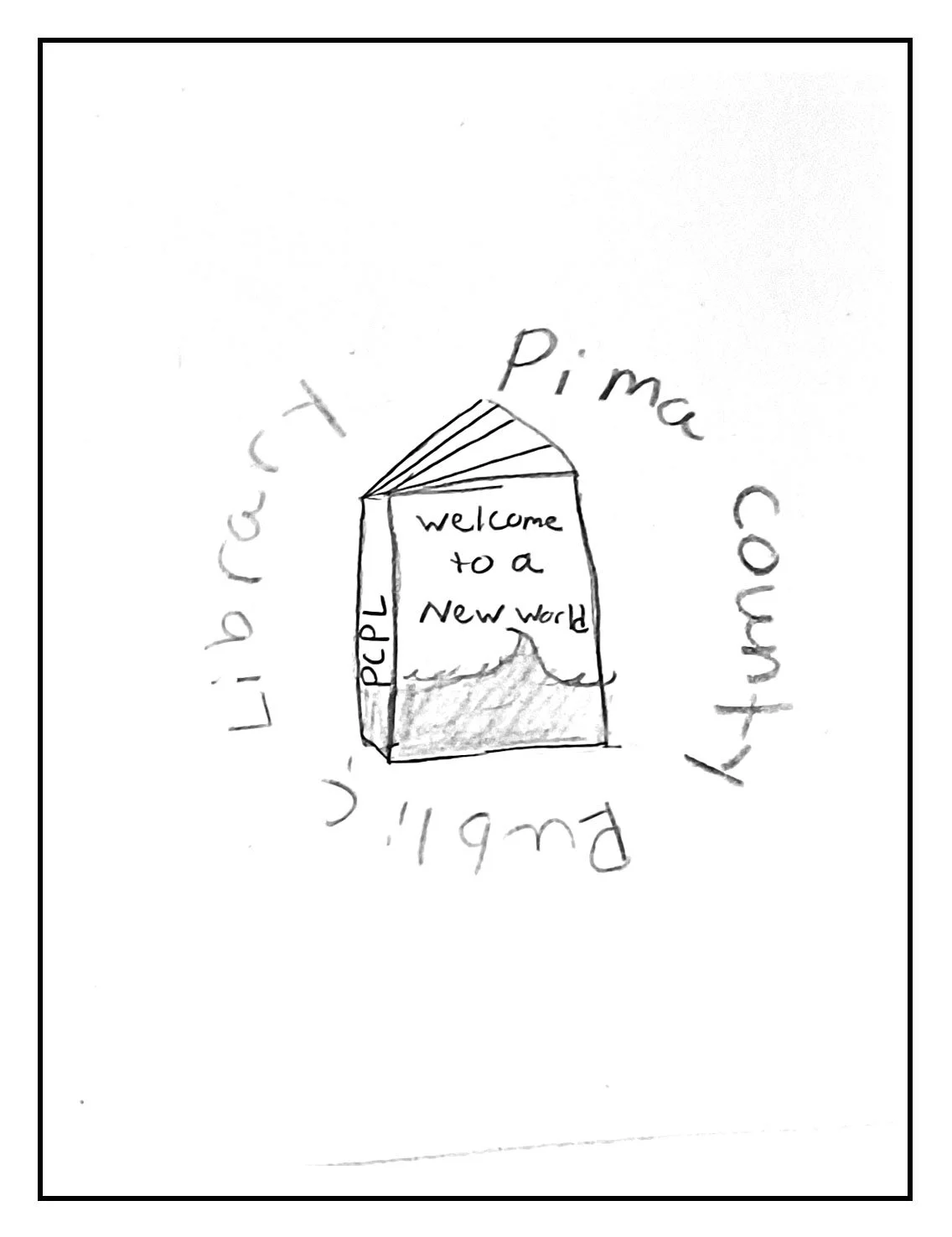
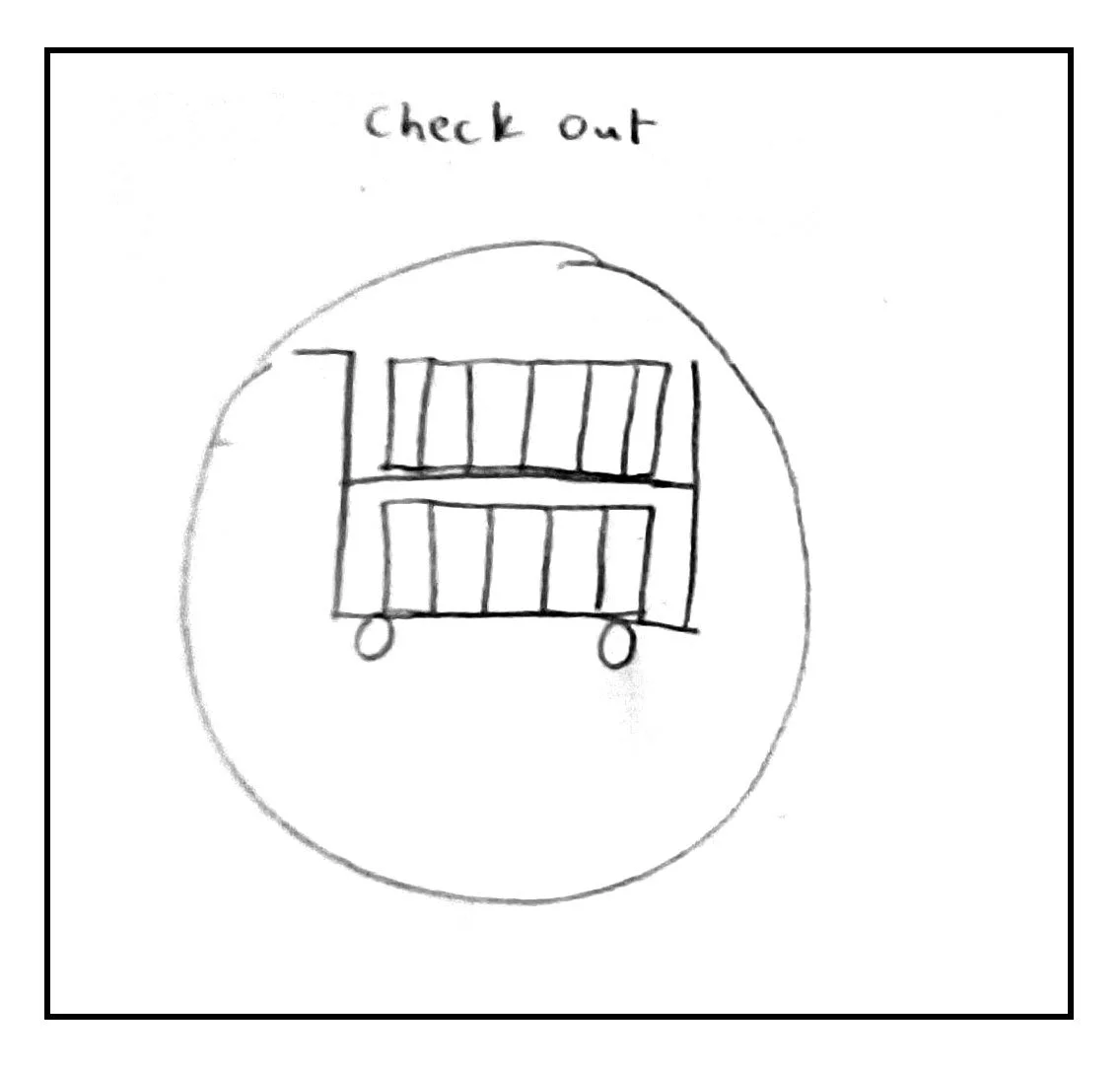
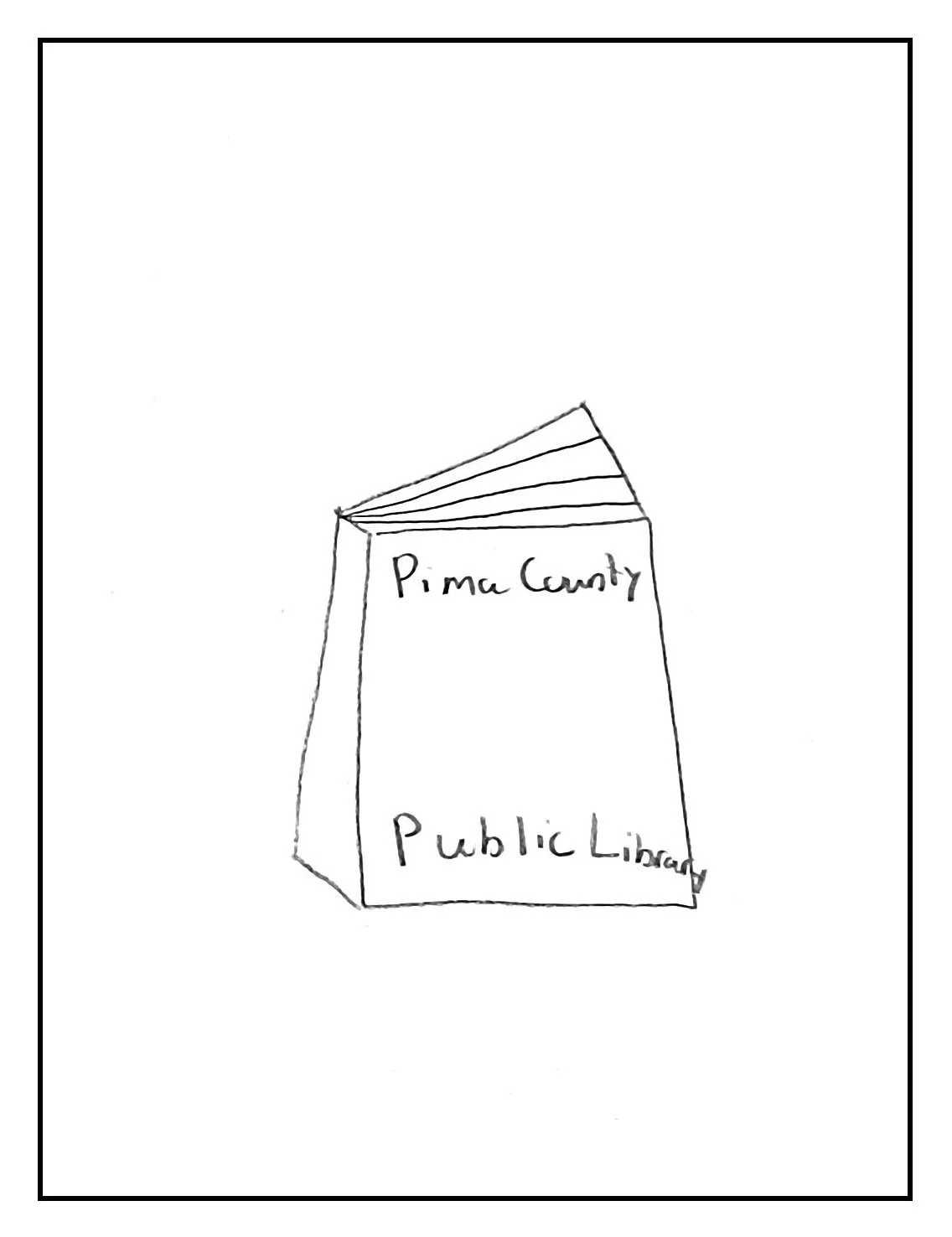
I explored different logo concepts inspired by books, pages, and the idea of a library. I also developed pictogram concepts for the different library sections and explored how the logo, typography, pictograms, and signage could work together as one visual system.
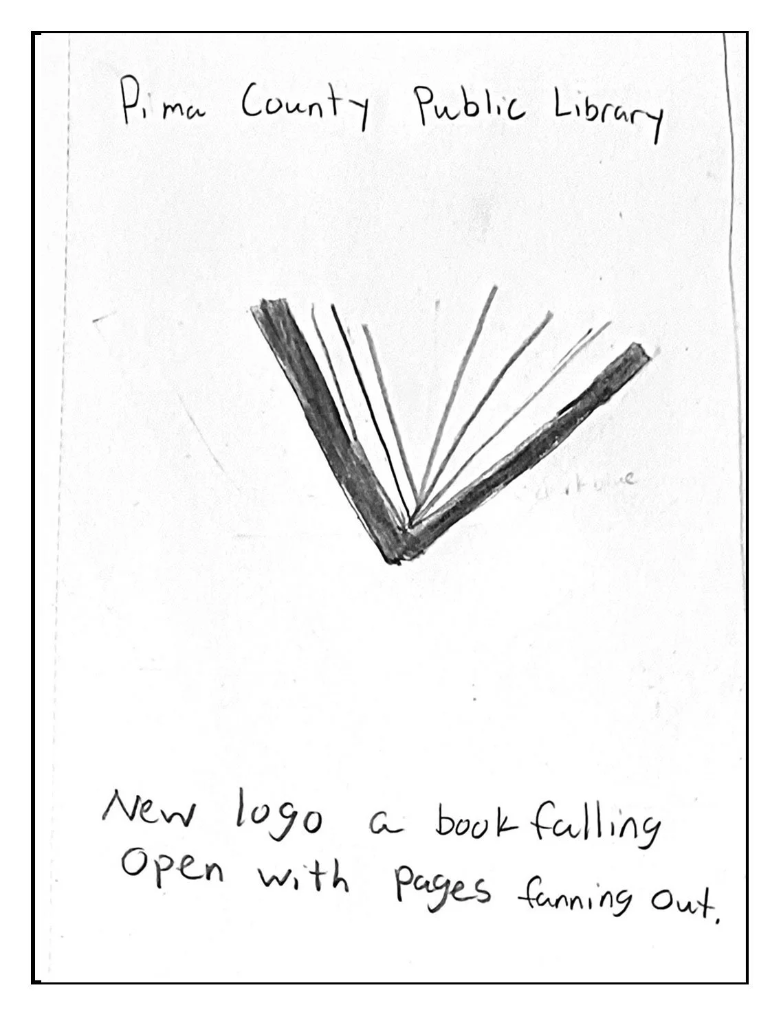
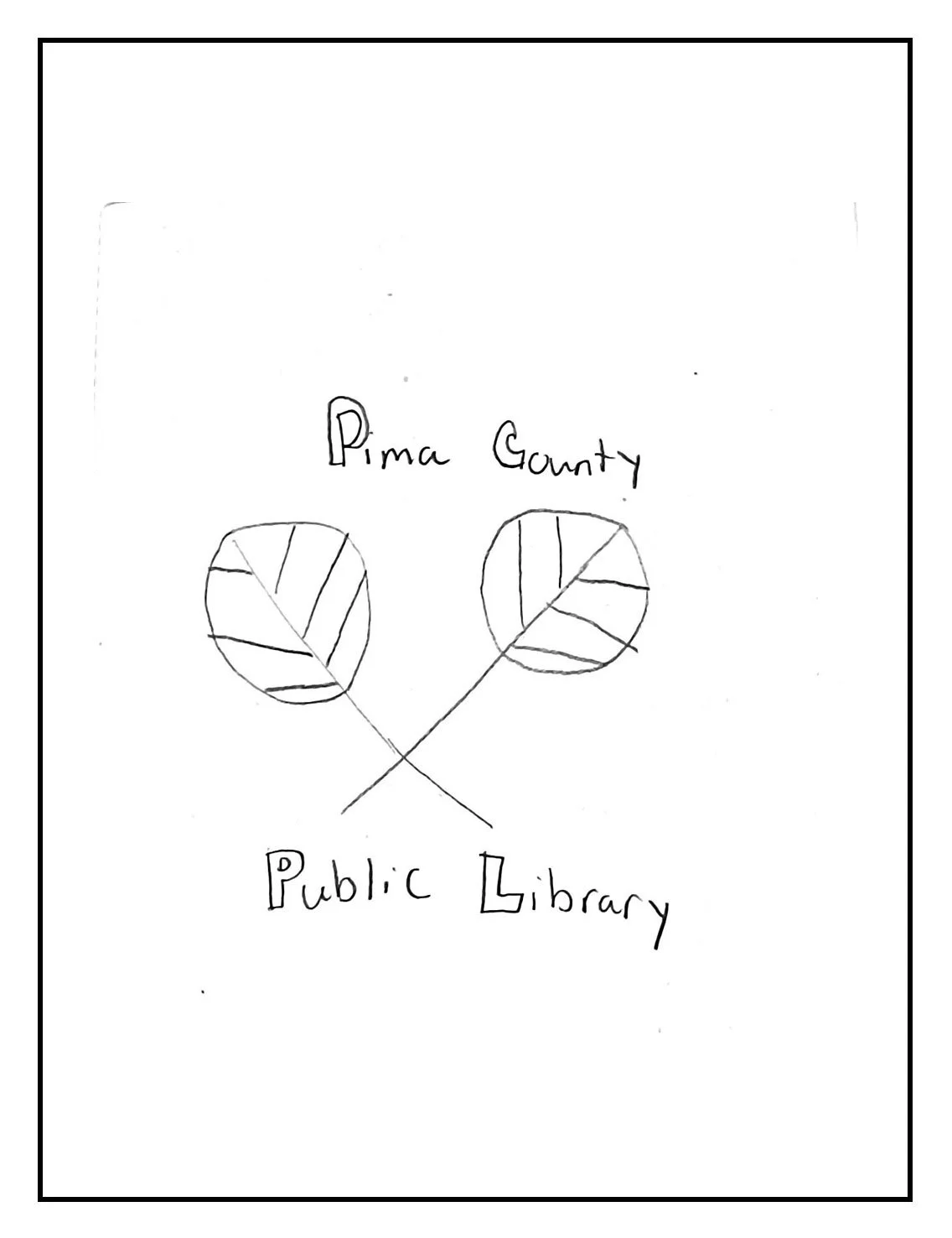
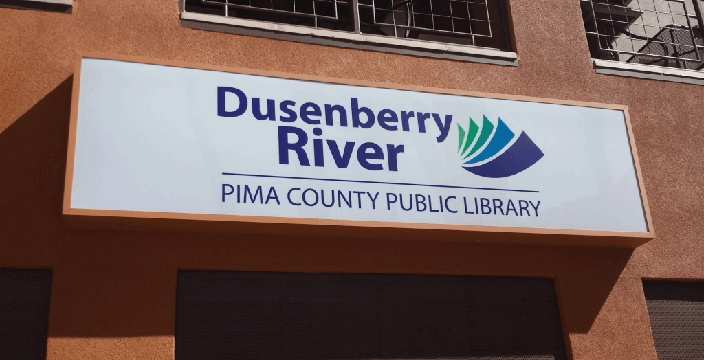
Old Logo Pain Points
Logo used for whole Pima County Public Library facilities.
Only one difference is the name of the branch on top.
Dusenberry and River do not need to have their own line.
Logo does not look like a book or pages.
Logo looks messy.
Iterations
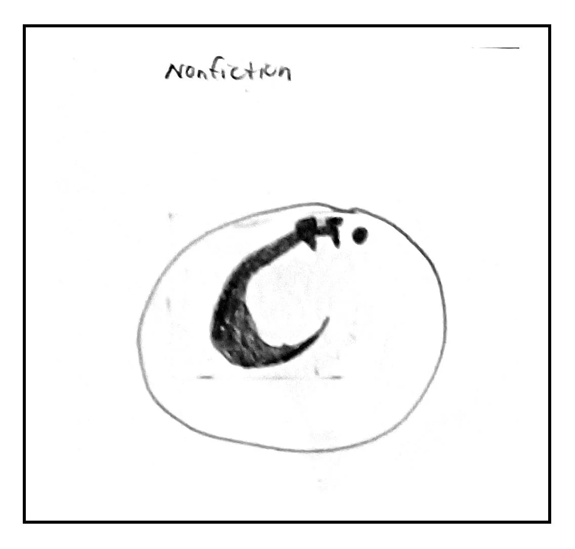
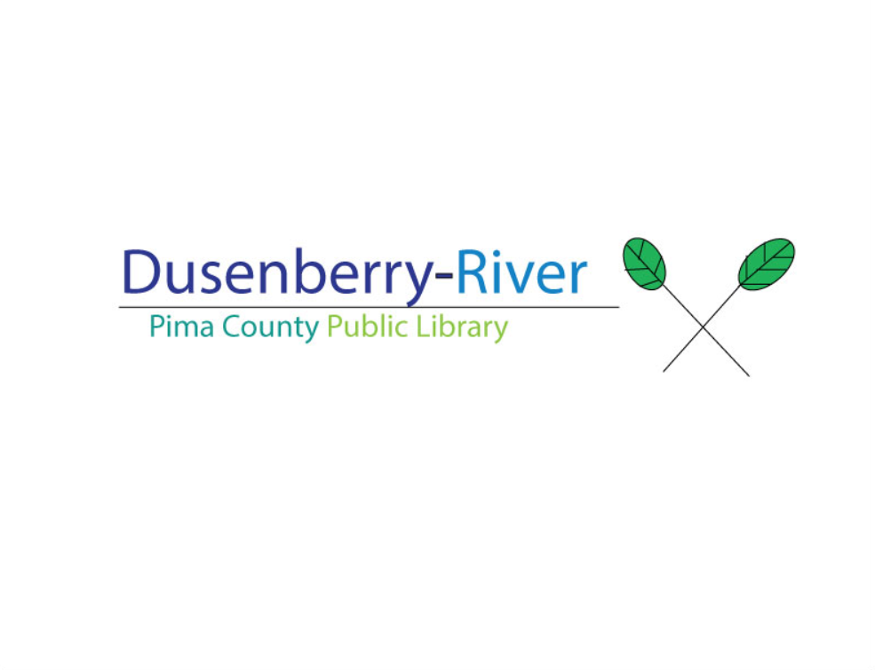
I created sketches and refined the logo and pictograms based on their ability to communicate clearly. I explored different visual forms before simplifying the identity and developing a consistent relationship between the logo and pictogram system. I then considered how the system could be translated into directional signage and the physical library environment. I wanted to have the idea of nature
Decisions
I decided to create a simpler and more recognizable library identity and develop pictograms that could communicate different sections quickly. I established a consistent visual language between the logo and pictograms and carried that language into the signage and environmental applications.

Color Palette
The main color for the logo was the dark blue. This blue gives the feeling of calmness but also can remind people of the waves. The black was used as an accent throughout the rebranding.

Hex: #2b398e
RGB: 43, 57, 142
CMYK: 70, 60, 0, 44
Hex: #000000
RGB: 0, 0, 0
CMYK: 0, 0, 0, 1
Typography
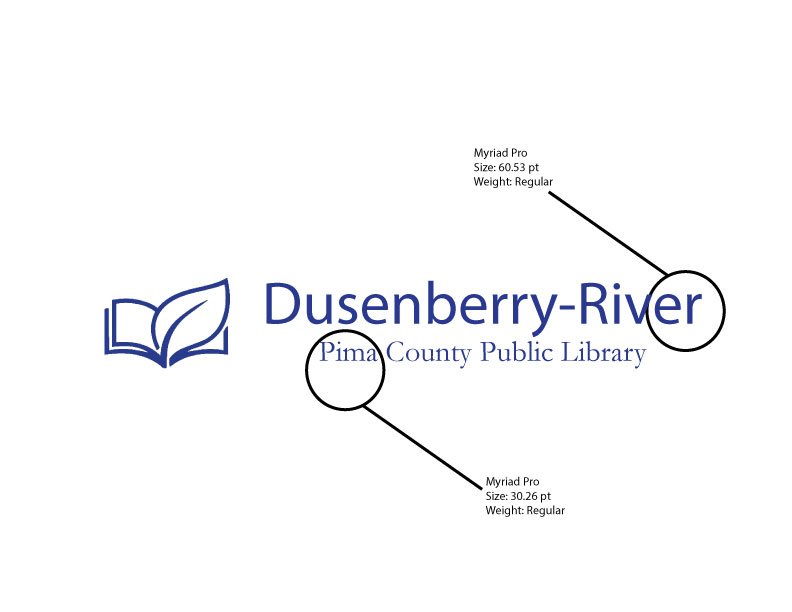
The typography used for this rebranding was simple yet readable. The library wanted something people can easily read. Also, something that everyone can find in the signage. Using the Myriad Pro was the answer to these requests.
Final Solutions
The final solution is a complete library rebrand and wayfinding system consisting of a new logo, typography, color, pictograms, signage, and environmental applications. The system provides the library with a more cohesive visual identity while helping users navigate the space.
New Logo Solutions:
Logo is clean and simple.
Dusenberry-River all on one line.
The name of library brand bigger than Pima County Public Library facilities.
Logo is a book made with a leaf to bring the nurture and learning together.

Pictogram Finals Designs
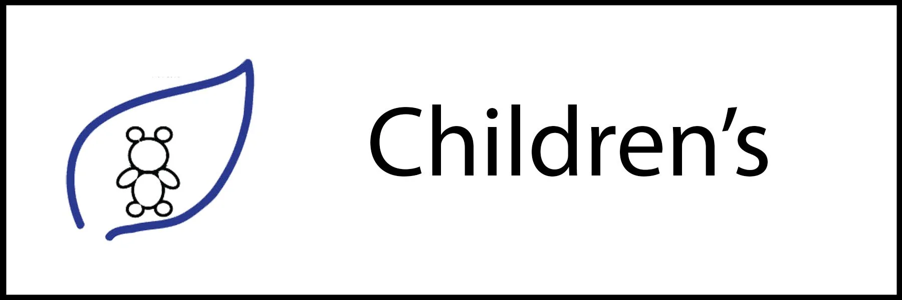
The pictograms finally had the nature theme to them. With the blue leaf around the pictogram. All are all strokes and nothing is filled. Each one represents the different areas found in the library.












Signage