
David Carson
This project was to create an art show for the graphic designer David Carson. Using his style of craziness and pops of color, I created a poster, billboard, ticket, program, and web banner that looks like something David Carson might have created. Also, these were used as advertisements and physical items for the art show.
Art Exhibition Promotional Campaign
Tools: Adobe InDesign, Adobe Illustrator, Adobe Photoshop
Year
2026
Research
I researched David Carson's work and studied his approach to experimental typography, collage, layering, color, and composition. I looked at how he treated typography as both information and a visual element and used those observations to develop a visual direction for the campaign.
Audience
The campaign was designed for people interested in graphic design and art who would potentially attend a David Carson exhibition. The materials needed to communicate information about the event while also creating a visual experience that reflected Carson's experimental design approach.
Concepts
I explored experimental typography, collage, layered imagery, color combinations, and the use of individual letters as graphic elements. I also considered how the visual language could be adapted across different promotional materials rather than being limited to a single poster.
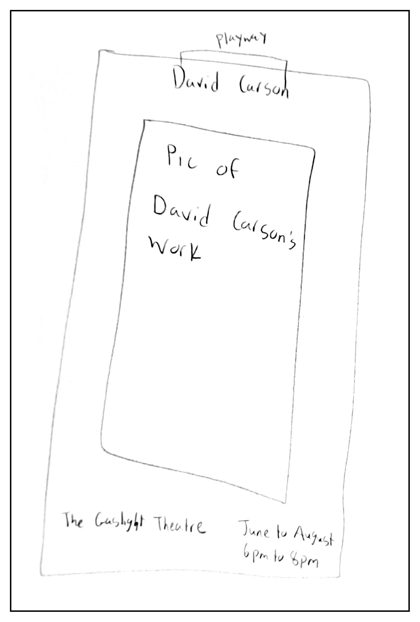
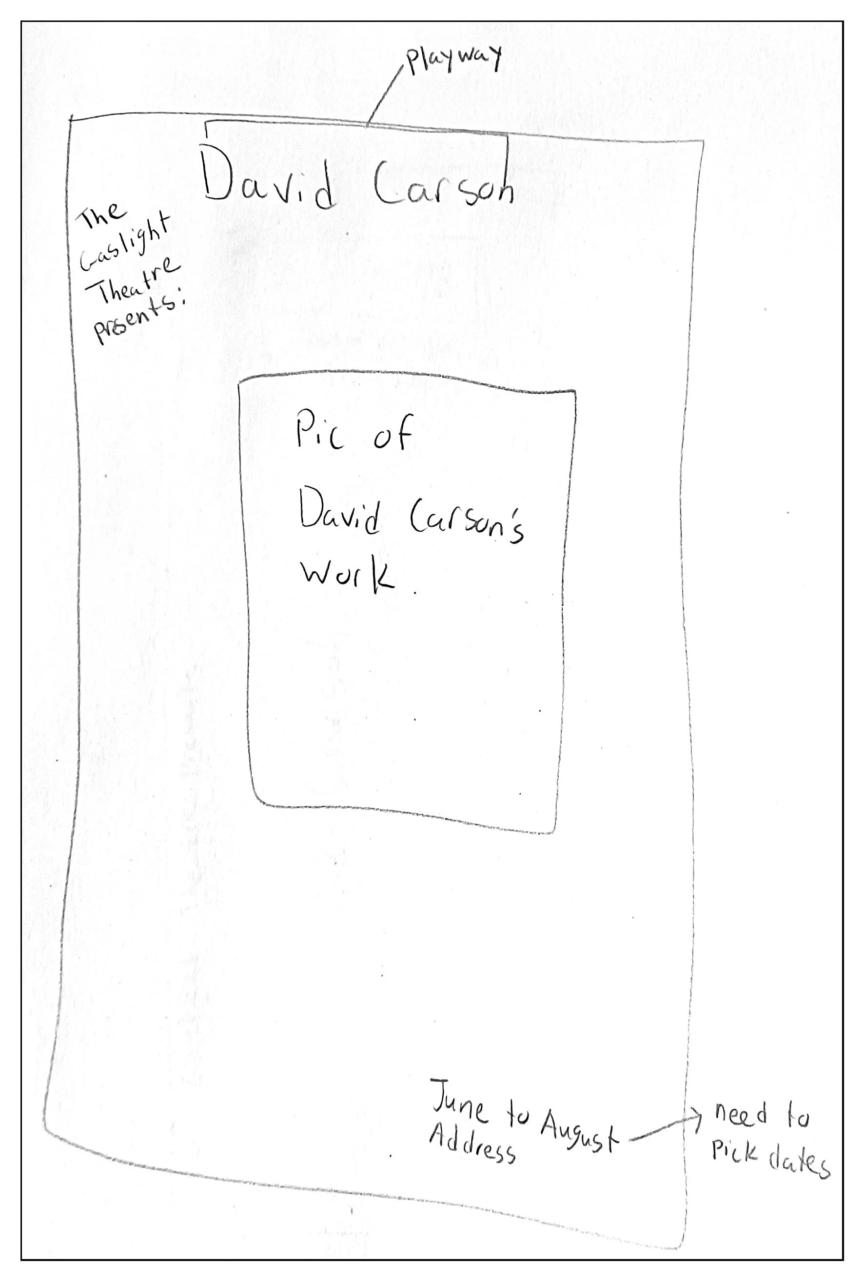
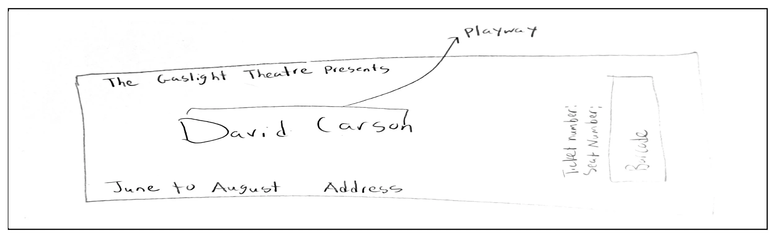
Iterations
I developed digital drafts and evaluated how the typography and imagery interacted with one another. In the earlier version, the boxes surrounding the text and imagery caused the elements to feel too separated. I also found that the color treatment did not feel sufficiently connected to the experimental visual direction. I revised the composition, integrated the elements more closely, refined the colors, and expanded the campaign into additional formats.
Digital Drafts
The colors did work together but it did not look like something David Carson might create. I also started to box in the text and the different images found that they started to make each part be an element on their own and had no tie to each other. I decided to add on a billboard and web banner as well.
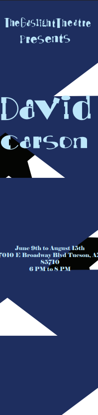
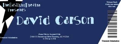
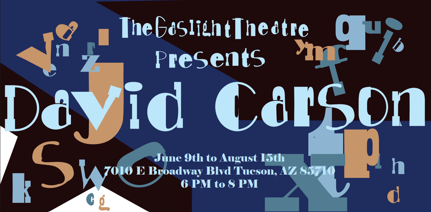
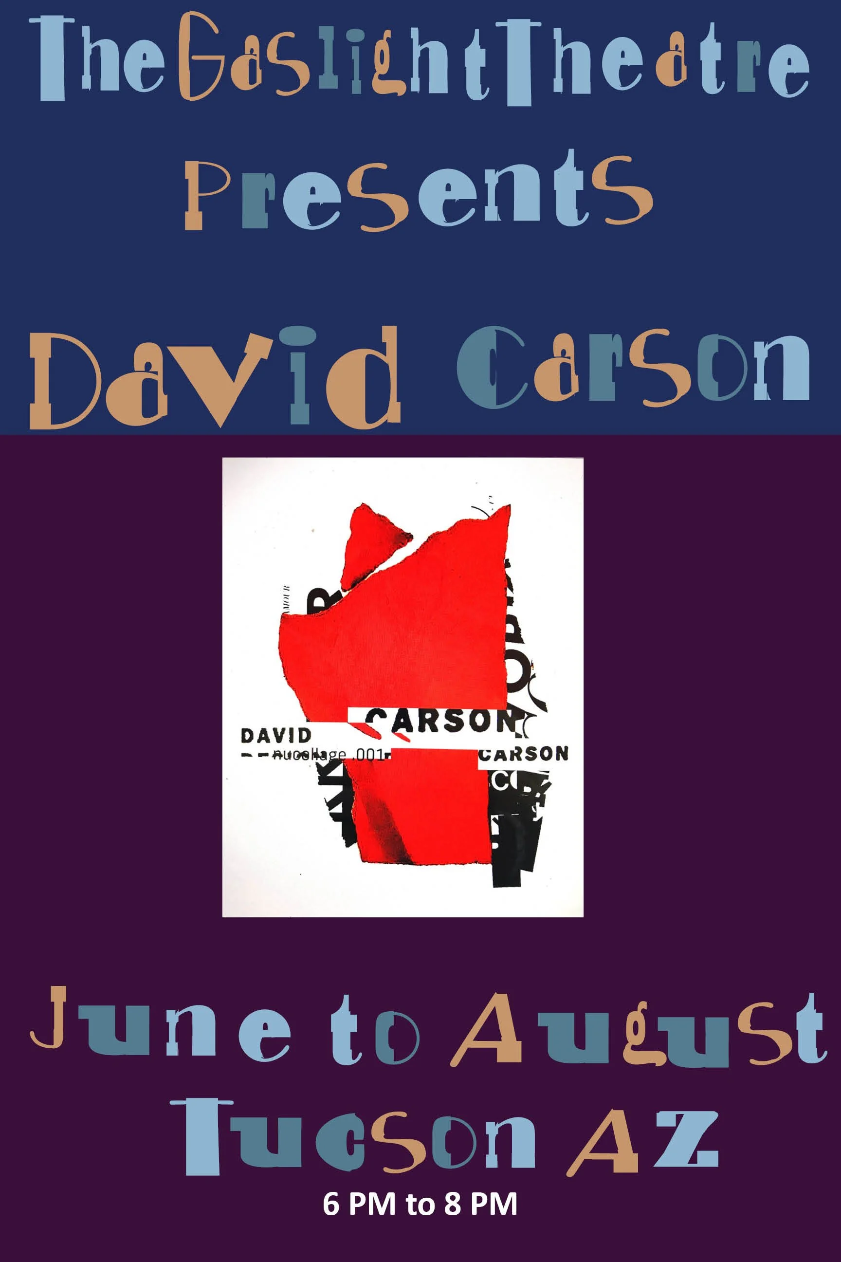
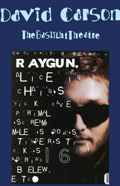
From top left to right:
poster, ticket, web banner, billboard, and program front cover.
Decisions
I decided to allow typography to function as part of the imagery rather than treating it only as information. I reduced unnecessary separation between visual elements and created stronger connections between type, imagery, and color. I also maintained a consistent visual language across the different pieces while allowing each format to have its own composition.
Color Palette
My ideas of color were based off the research I did looking at David Carson’s artwork. I wanted to use colors that were be able to pop on their own without the color being too overpowering to the main typography. The dark royal blue was used as the main color of the typography. While the other three colors are used in the letters that are found in the background and throughout some of the collages found throughout the pieces.
Hex: #1f2d5f
RGB: 31, 45, 95
CMYK: 67, 53, 0, 63

Hex: #8fb6d1
RGB: 143, 182, 209
CMYK: 32, 13, 0, 18
Hex: #c6936a
RGB: 198, 147, 106
CMYK: 0, 26, 46, 22
Hex: #537b8f
RGB: 83, 123, 143
CMYK: 42, 14, 0, 44
Typography
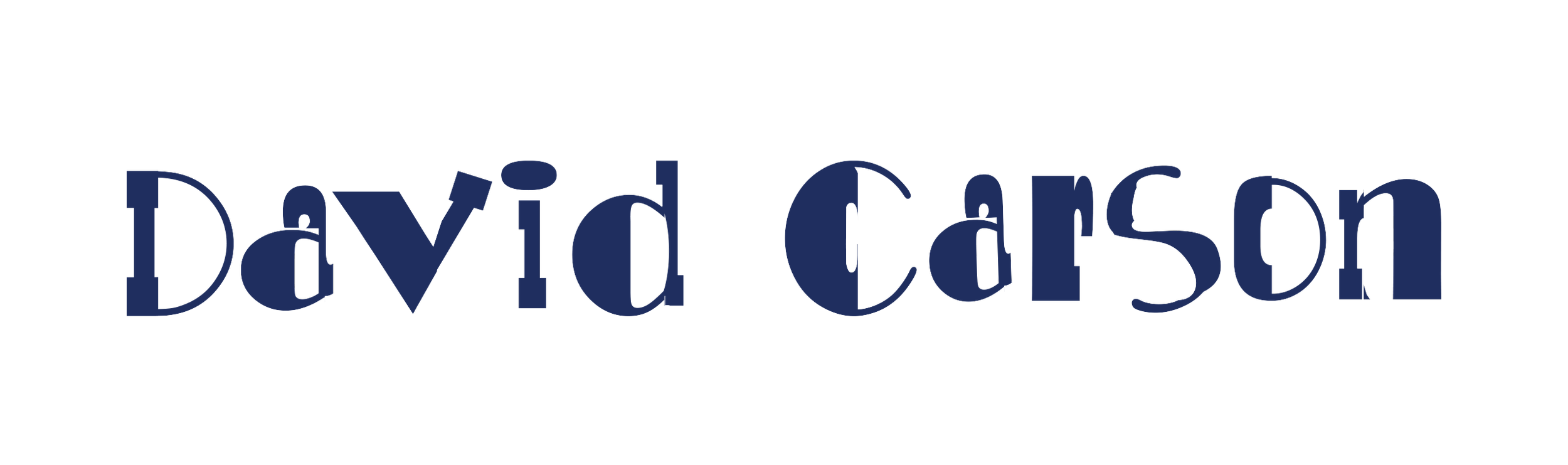
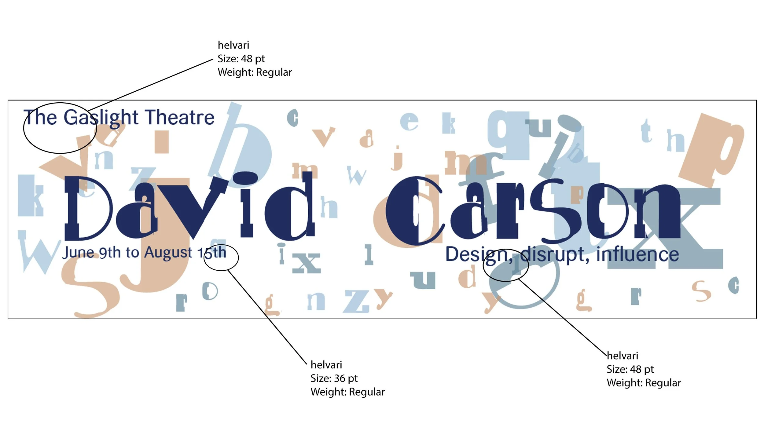
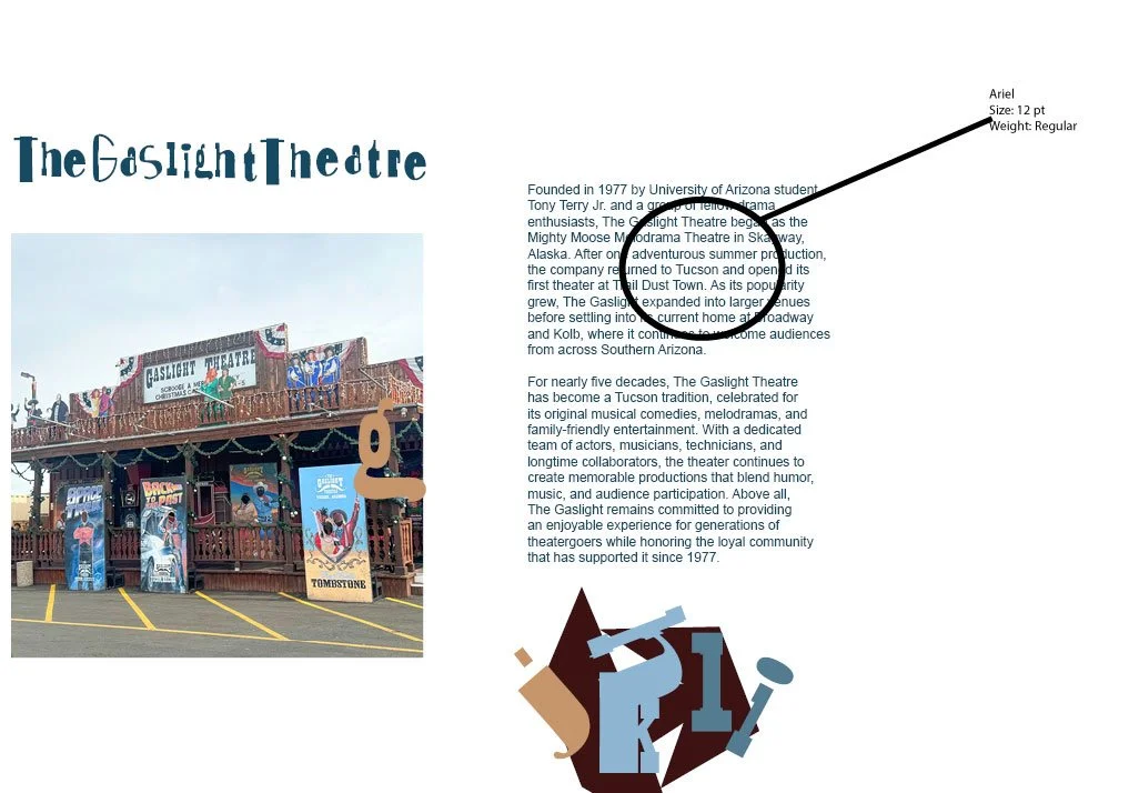
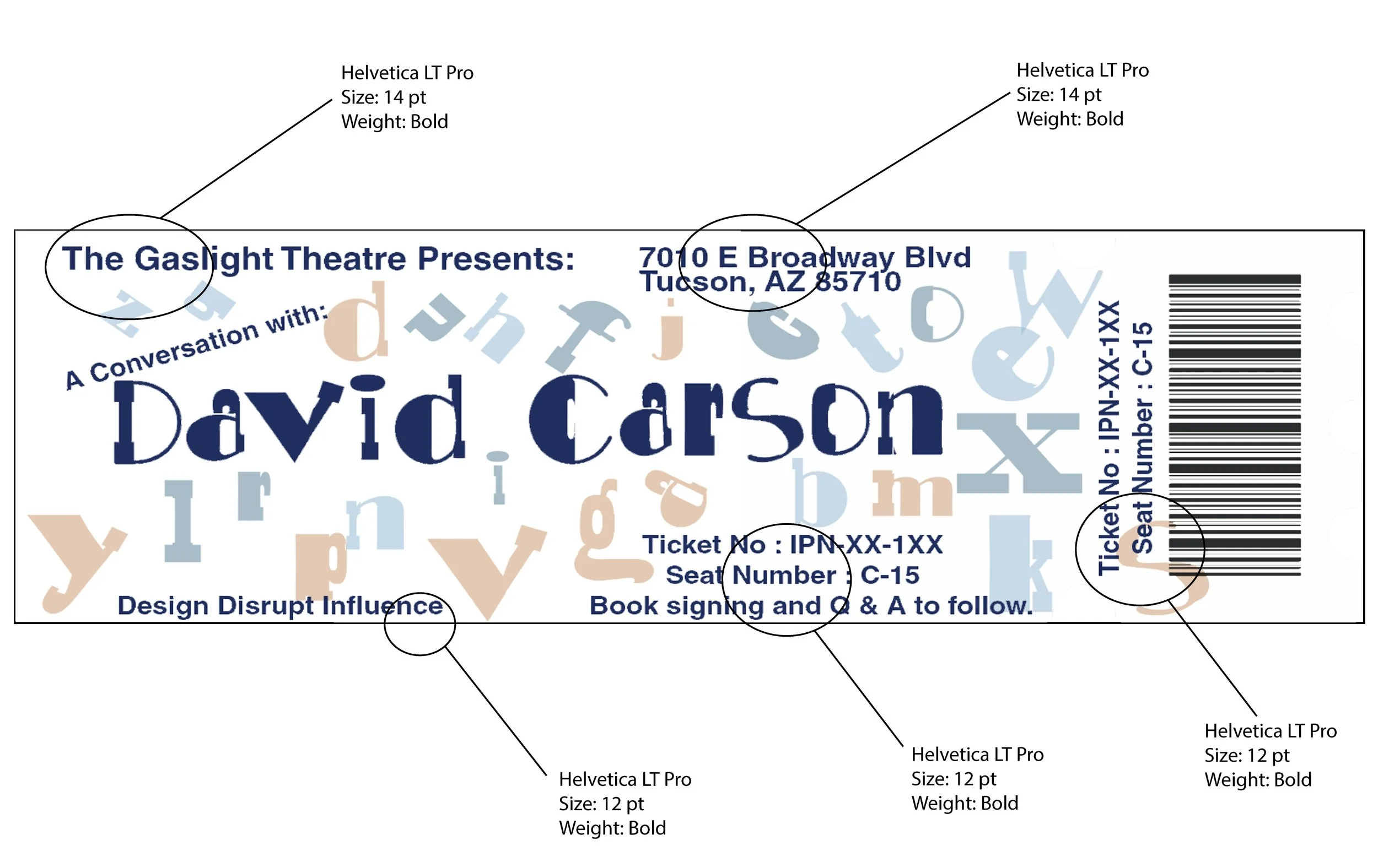
The from there the typography that had the information of the art show on the poster, program, billboard, and web banner was Helvari. The main information about David Carson and The Gaslight Theatre was Ariel and finally the information on the ticket was Helvetica LT Pro Bold.
Final Designs
From my research of David Carson’s work, I noticed he used color as a source of color and not as the main color background. Also, I wanted to incorporate the letters of my typography Playway into my pieces by using those letters in the background, faded a bit, and in the little collages I made. This brought more of the craziness to my pieces. I also wanted to make sure all the pieces flowed together. I wanted all my pieces to be eye catching yet being able to draw people in on wanting to see David Carson’s work.
Final Solutions
The final solution is a multi-format promotional campaign consisting of a poster, billboard, ticket, program, and web banner. Together, the pieces create a cohesive event identity inspired by David Carson's experimental approach to typography and graphic design.
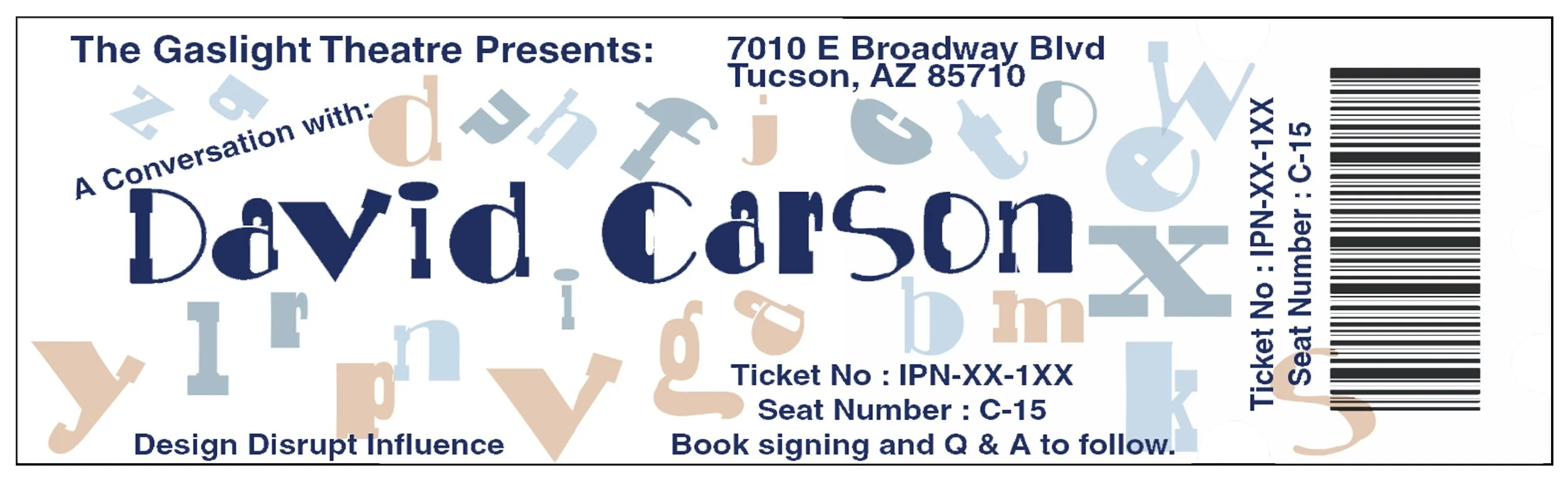
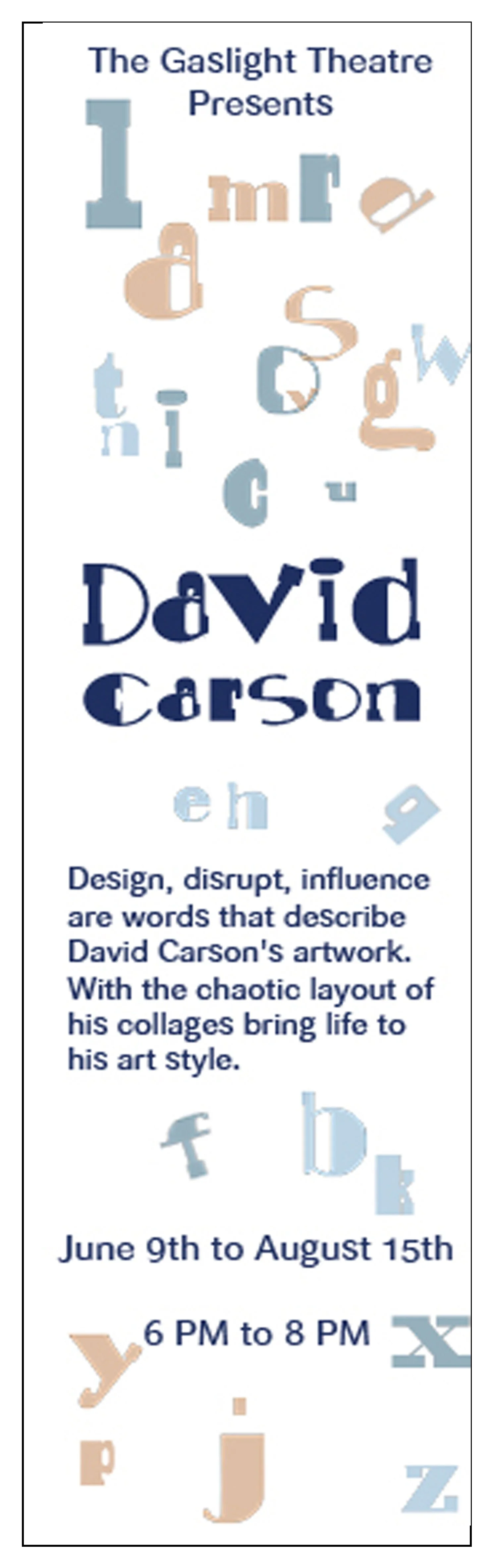
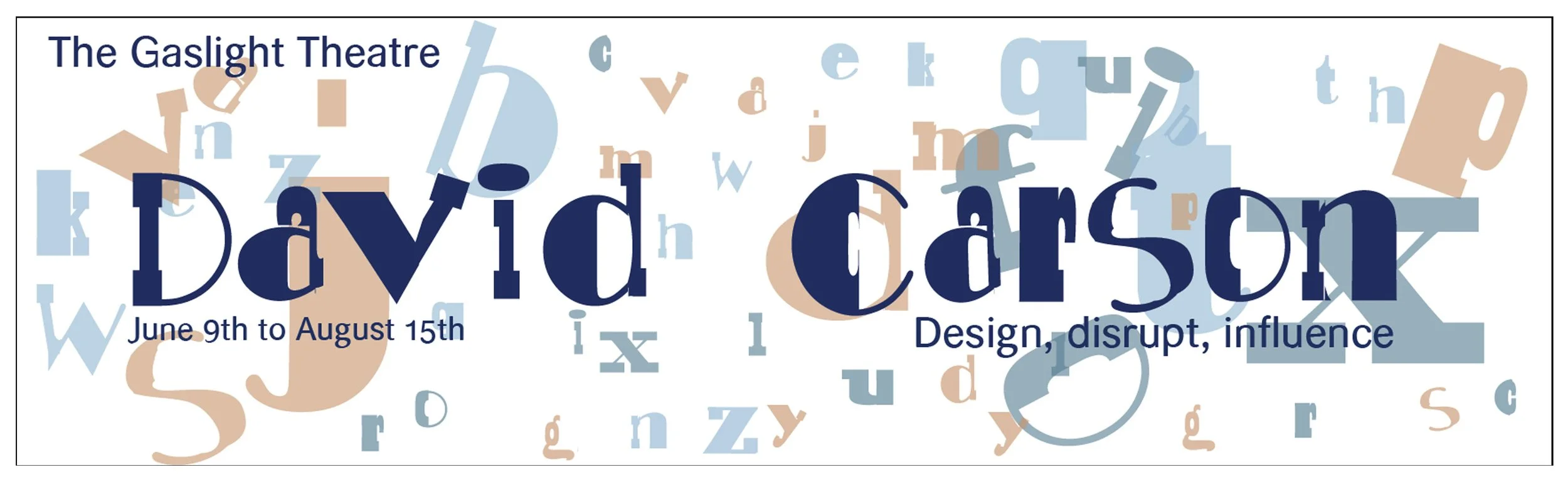
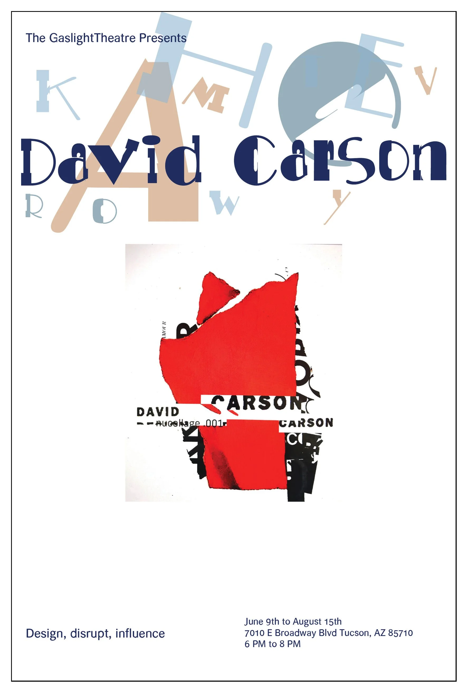
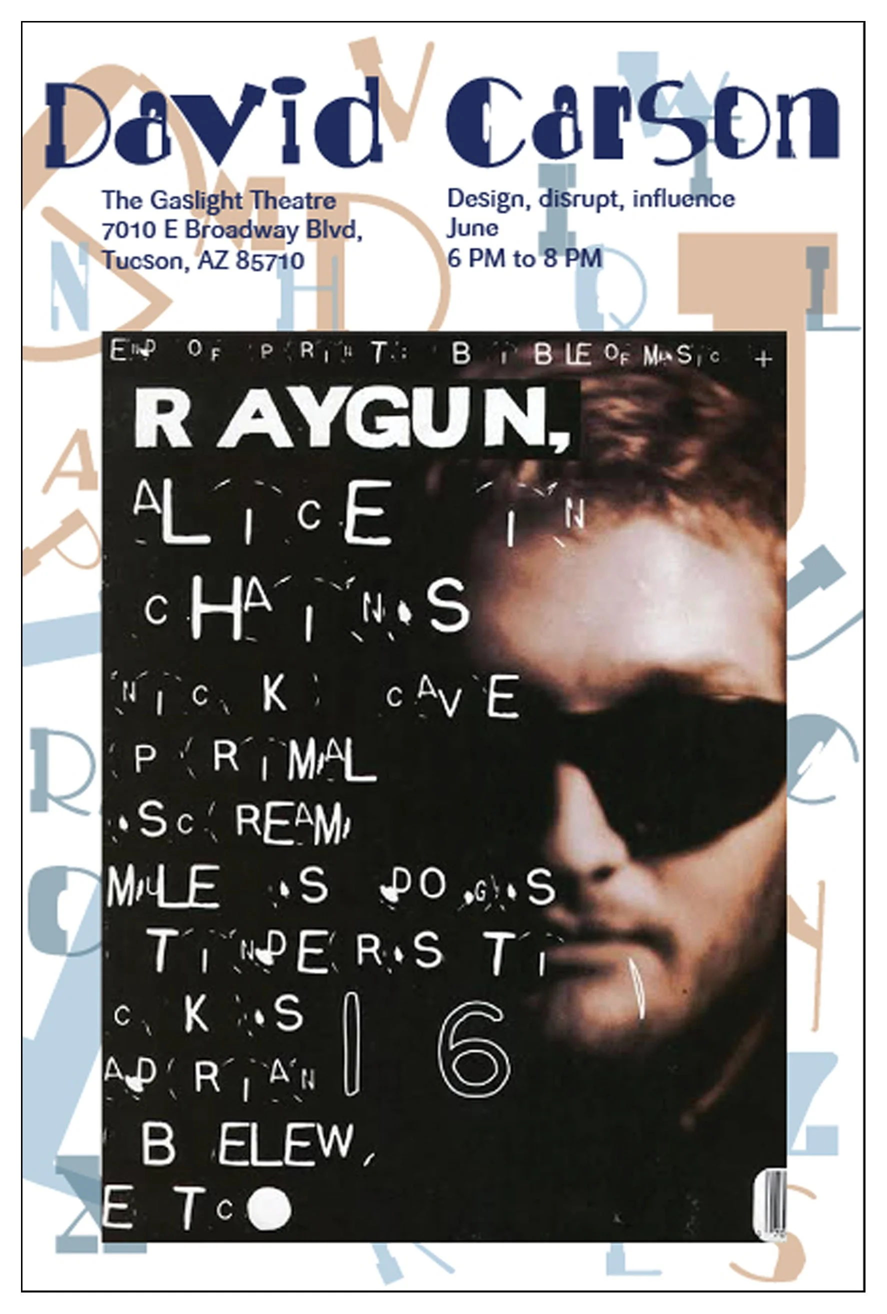
From top left to right:
poster, billboard, ticket, web banner, and program front cover.