
The Picture of Dorian Gray
The goal of this project was to redesign The Picture of Dorian Gray with a contemporary book cover that communicated the dark and Gothic atmosphere of the novel without revealing major plot points. The challenge was to create enough visual information to establish the story and mood while still maintaining mystery for the reader.
Book Cover & Editorial Design
Tools: Adobe InDesign, Adobe Photoshop, Adobe Illustrator
Year: 2026
Research
I researched the novel and identified important themes, characters, and visual elements that could be translated into the cover. I focused particularly on Dorian, the portrait, the Gothic atmosphere, and the setting. I also explored typography and color treatments that could communicate the darker psychological tone of the story.
Audience
The cover was designed for readers interested in classic literature and Gothic fiction, including a contemporary audience encountering the novel. The design needed to communicate the genre and mood quickly while creating curiosity about the story.
Concepts
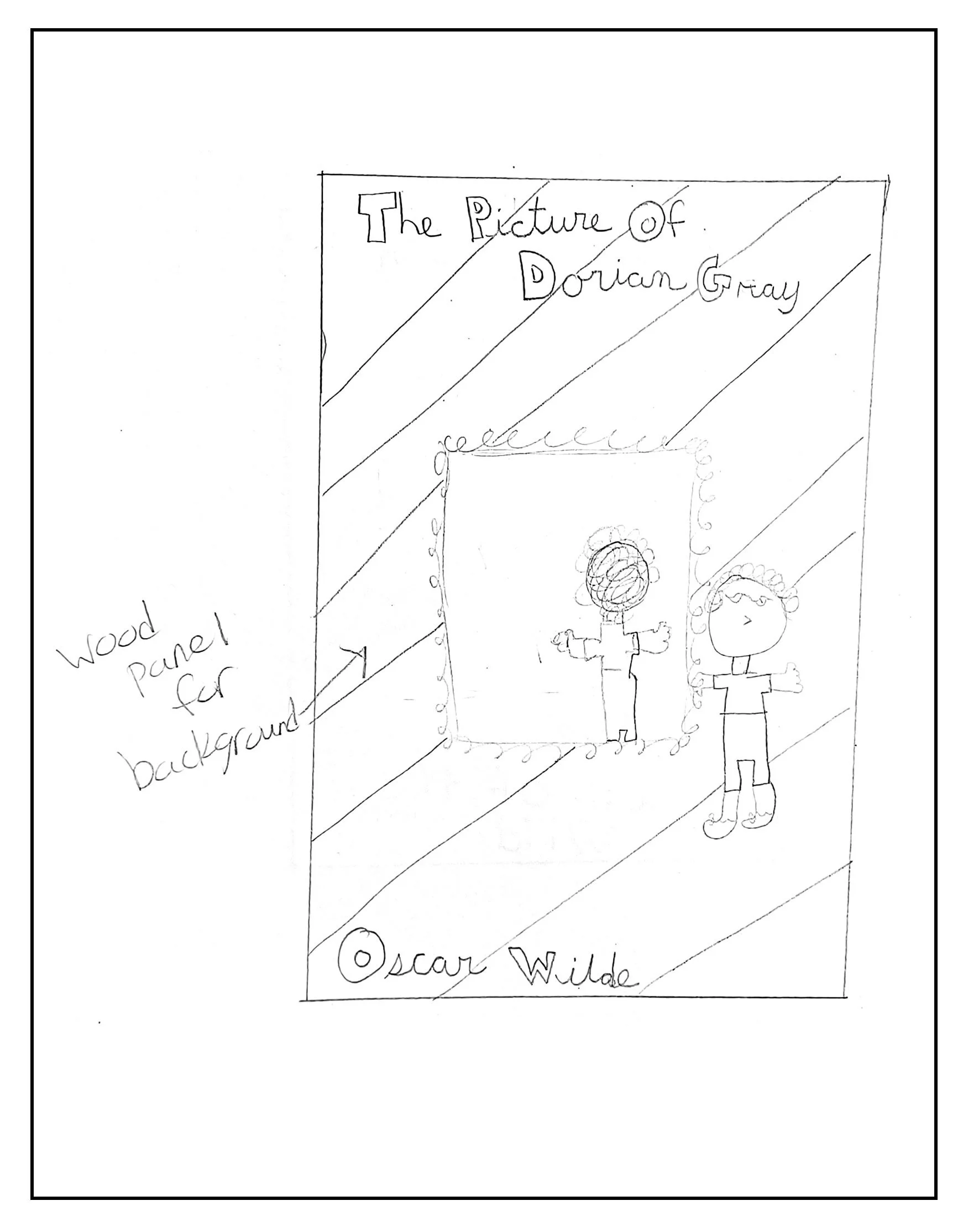
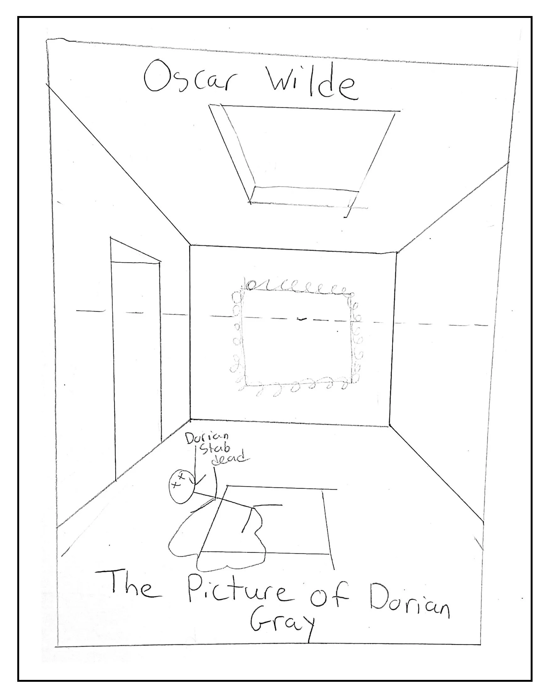
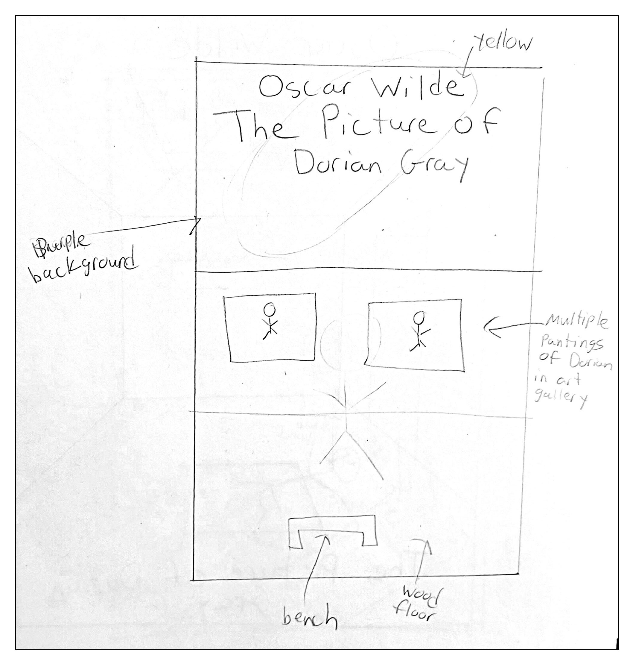
I explored different ways to represent Dorian, the portrait, and the darker elements of the story. I experimented with compositions involving the character, the portrait, an attic setting, different lighting treatments, and Gothic-inspired typography.
Iterations
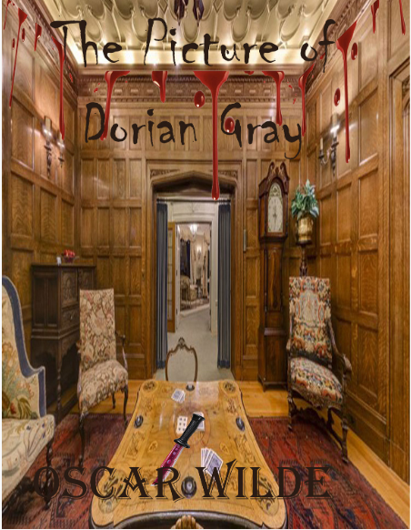
My first digital draft placed too much emphasis on the murder and did not represent Dorian or the portrait strongly enough. I also recognized that the concept risked revealing too much of the story. In the next iteration, I introduced Dorian, the portrait, and the attic environment while changing the typography and overall atmosphere. I continued refining the composition, lighting, colors, and title treatment.
Digital Draft One
The original idea of my book cover was to show some of the ideas of the books. This book cover shows a major murder that took place. But things were missing. For example, this book is about a character named Dorian Gray and there is no person on the cover to represent this character. Along with a major plot point has to do with a picture and there is no picture either. This draft did not work as it was missing many different plot points yet giving away a major plot point.
Digital Draft Two
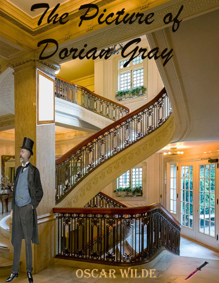
I changed the background of the cover, as the room I originally picked was keeping it all confined and did not feel there was enough space on the cover. The font went from a creepy looking font to more of a cursive font. Oscar Wilde got the tan color that is found in the final design of the book cover. Also, the stairs area ended up being too bright for a Gothic, moody story. I did add a picture frame to represent the picture. I also added a person to represent Dorian Gray.
Decisions
I decided to use the attic as the setting and include Dorian and the portrait as visual clues without explicitly explaining their significance. I used a darker, muted color palette to establish the Gothic mood and selected typography that supported the tone of the novel. I also extended the design beyond the front cover into a complete book jacket.
Color Palette
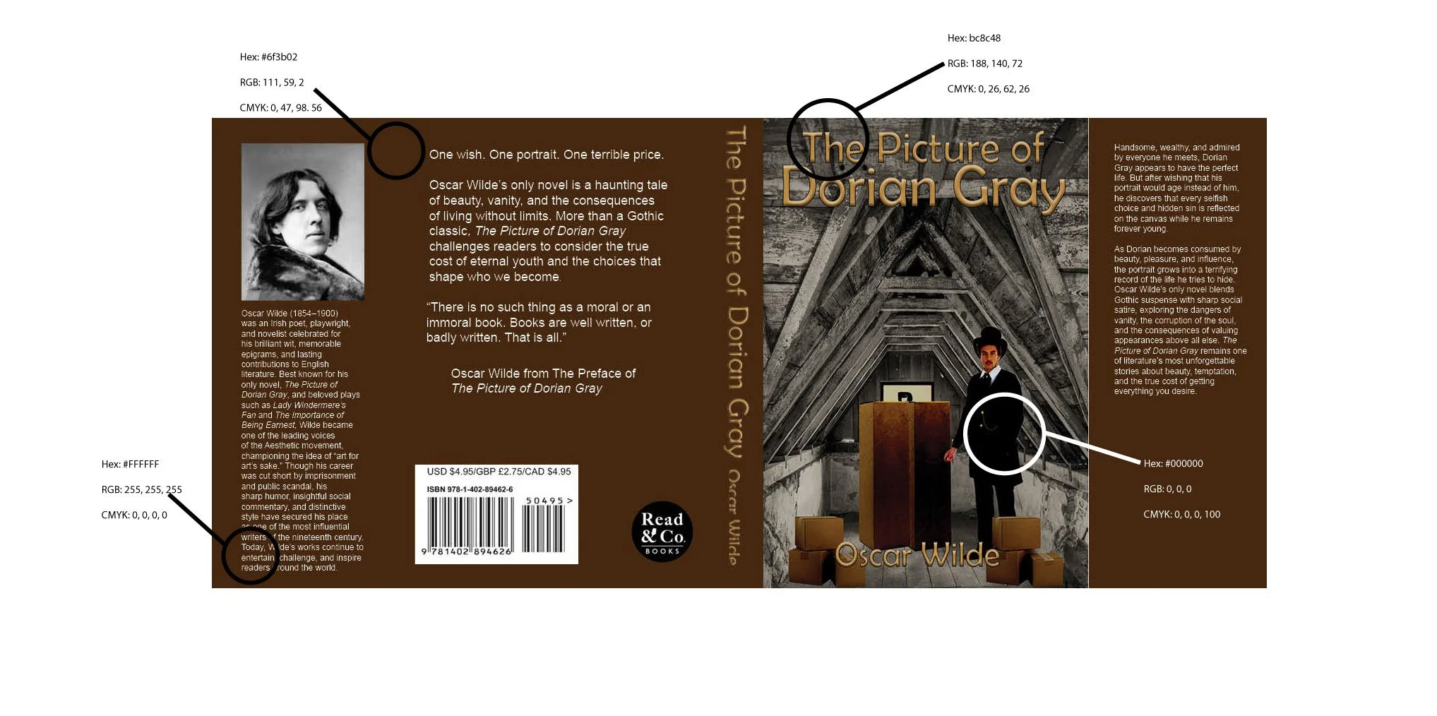
The color palette was to be moody and Gothic themed. The dark colors of black and brown to add to the moodiness. While the white and tan are a neutral color of the book cover.
Typography
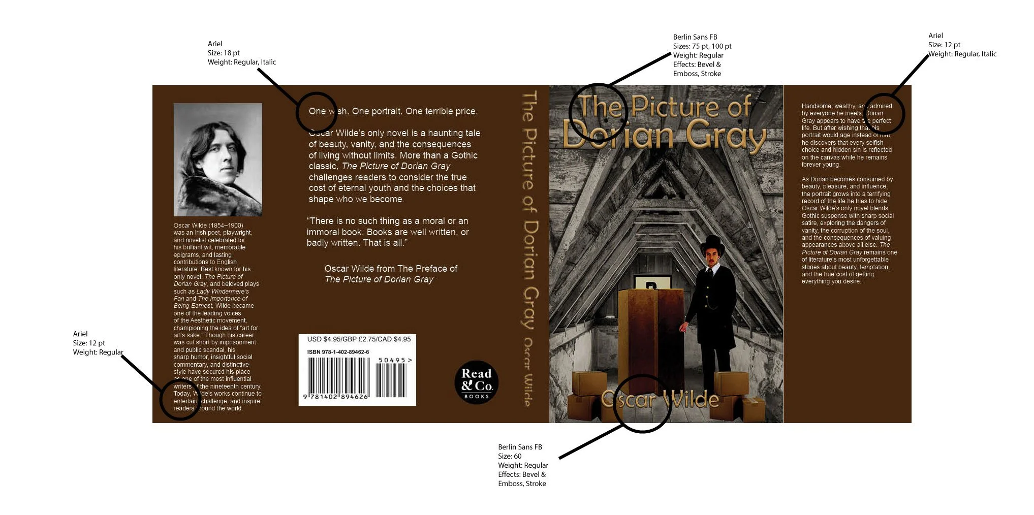
The typography for this project I wanted to lean into the gothic and moodiness of the story. So, I used Berlin Sans FB Regular for the title of the book and Oscar Wilde’s name. I used some effects on the typography on the front cover to give it that almost 3D looks to it. Plus, I changed the color of the title and the author’s name to a tan shade. As for the rest of the cover, the typography used was Arial.
Final Solution
The final solution is a complete book cover and jacket that uses imagery, typography, color, and composition to communicate the dark and mysterious atmosphere of The Picture of Dorian Gray. The design gives readers visual clues about the story while preserving enough mystery to encourage them to explore the book.
Final Design
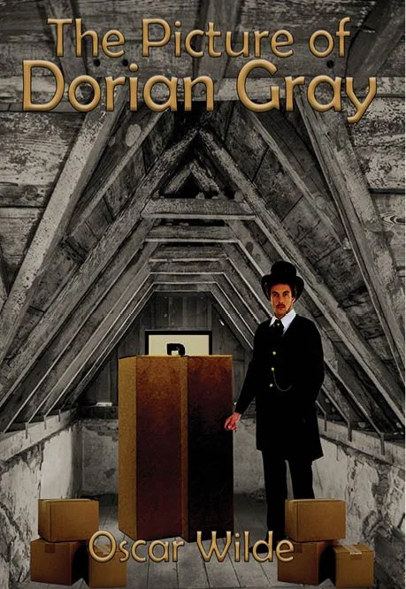
The final design turned into a person who represents Dorian Gray in an attic where he hides the picture. That is why there are boxes in front of the picture. The font has the feel of being 3D so popping out from the cover. Plus, the font is easier to read. The book cover is showing as if Dorian Gray is showing someone in front of him where the picture is.
Final Design Book Jacket
Here is the final design of the whole hardcover book jacket. The jacket is brown in color, found on the boxes. The book jacket is to look like one that you can find for a hardcover book. The cover is organized and easy to read.
