Dusenberry-River Library Rebranding
The library wanted to bring its branding into the modern era. The library wanted something simple but still easy to indentify. The library wanted something that would catch someones’ eyes. Since they are in a plaza that has a Whole Foods and a Petco. Along with some other smaller shops and resturants.
Purpose: To give the library a more modern day look.
Programs: Adobe Illustrator
Project: Rebranding
Year
2026
Preliminary Sketches
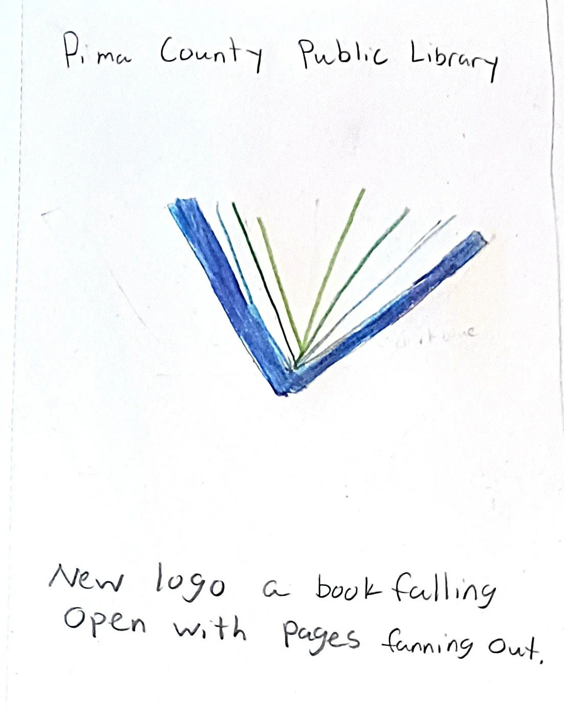
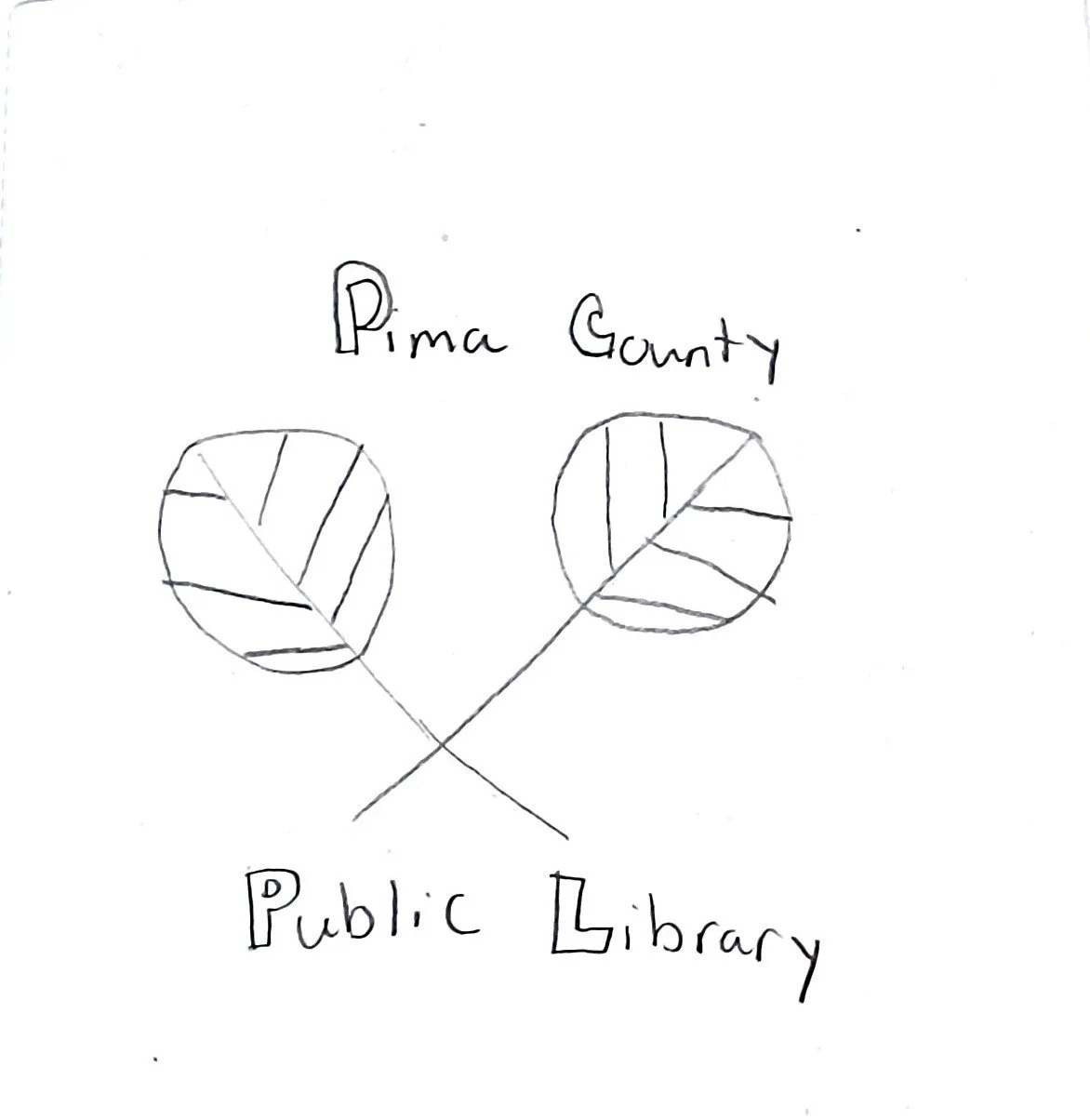
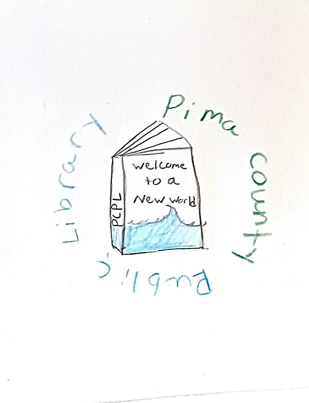
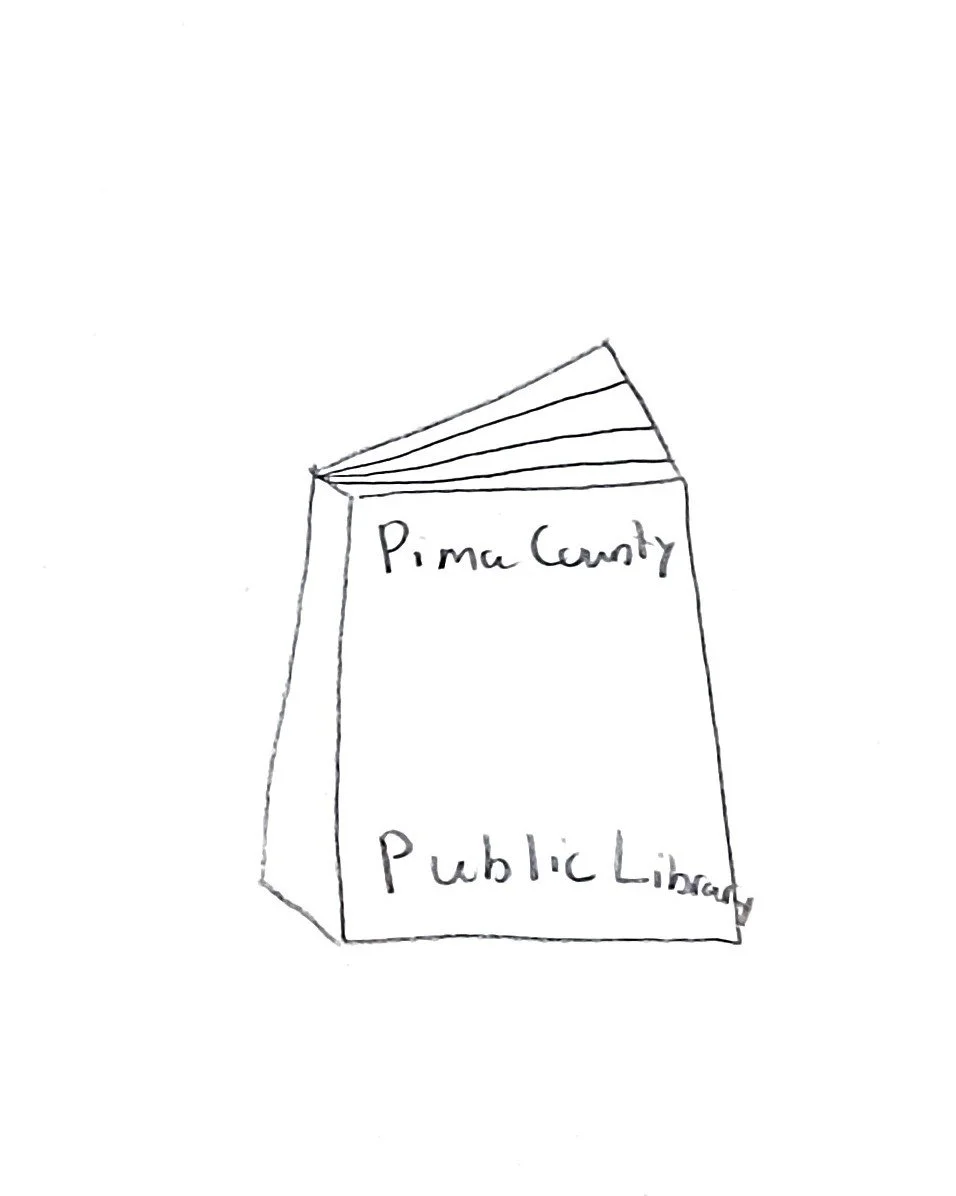
Taking the colors of the orignal logo and using the theme of nature to tie in the my inital ideas together. Since the library is a place that nurtures reading, I wanted the feel of nature in the logo.
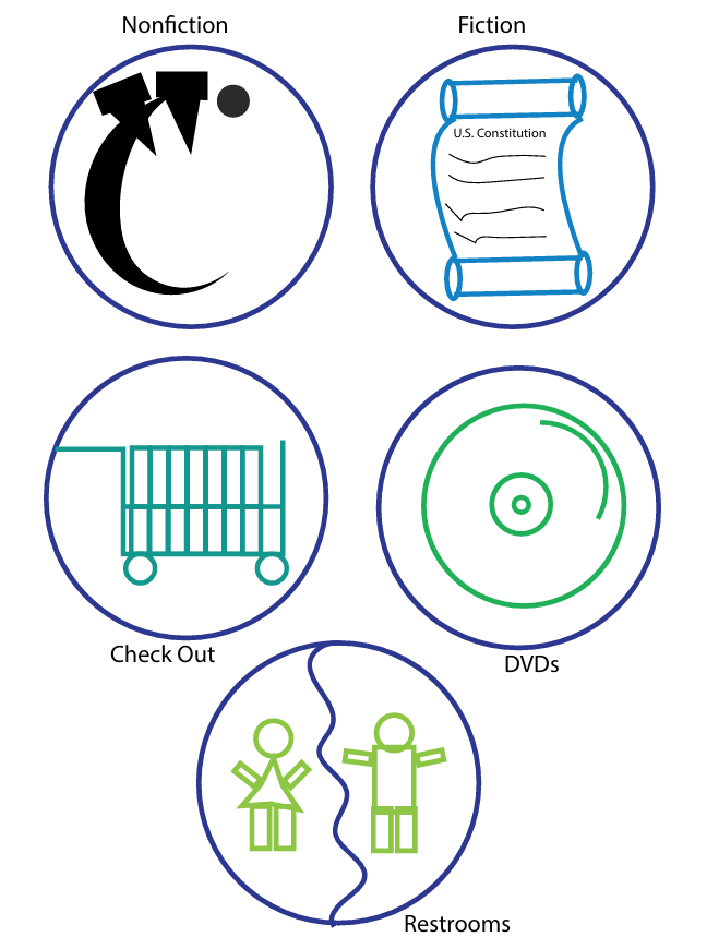
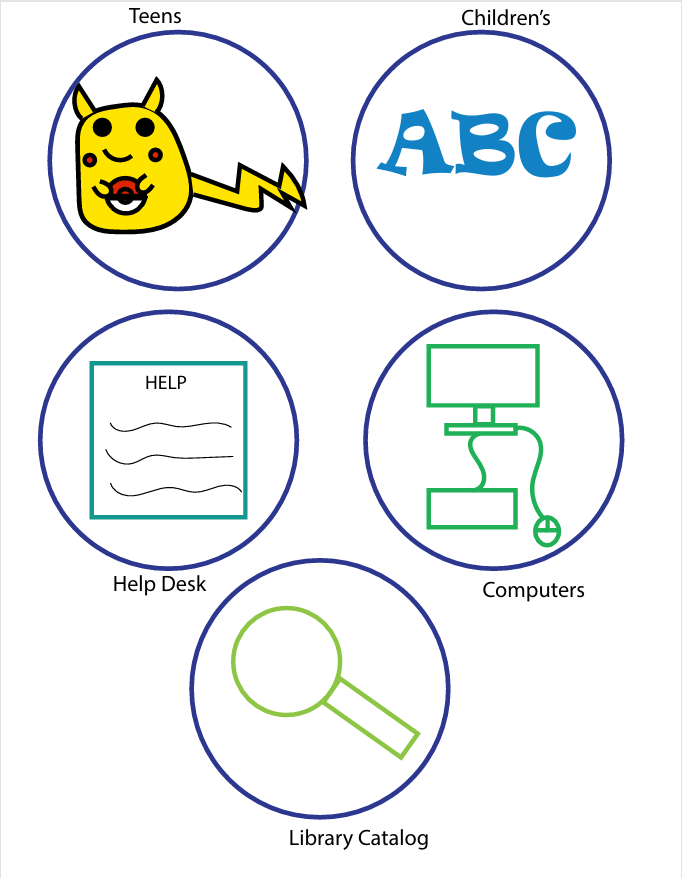
The perliminary digital sketches for the pictograms, were created to find the different sections in the library. Orginally there was going to be a circle as the background but I ended up using a leaf shape as the background. To pull in the nature theme for the pictograms.
Color Palette
Dark blue was the main color used for the logo. This gives the logo that calming feeling to the logo. This blue also comes from the original logo. These colors were also used in the pictograms.
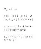
Typography
The typography used for this rebranding was simple yet rereadable. The library wanted something people can easily read. Also something that everyone can find in the signage.
Old Logo
Pain Points:
Logo used for whole Pima County Public Library facillities.
Only thing different is the name of the branch on top.
Dusenberry and River do not need to have their own line.
Logo does not look like a book or pages.
Logo looks messy.
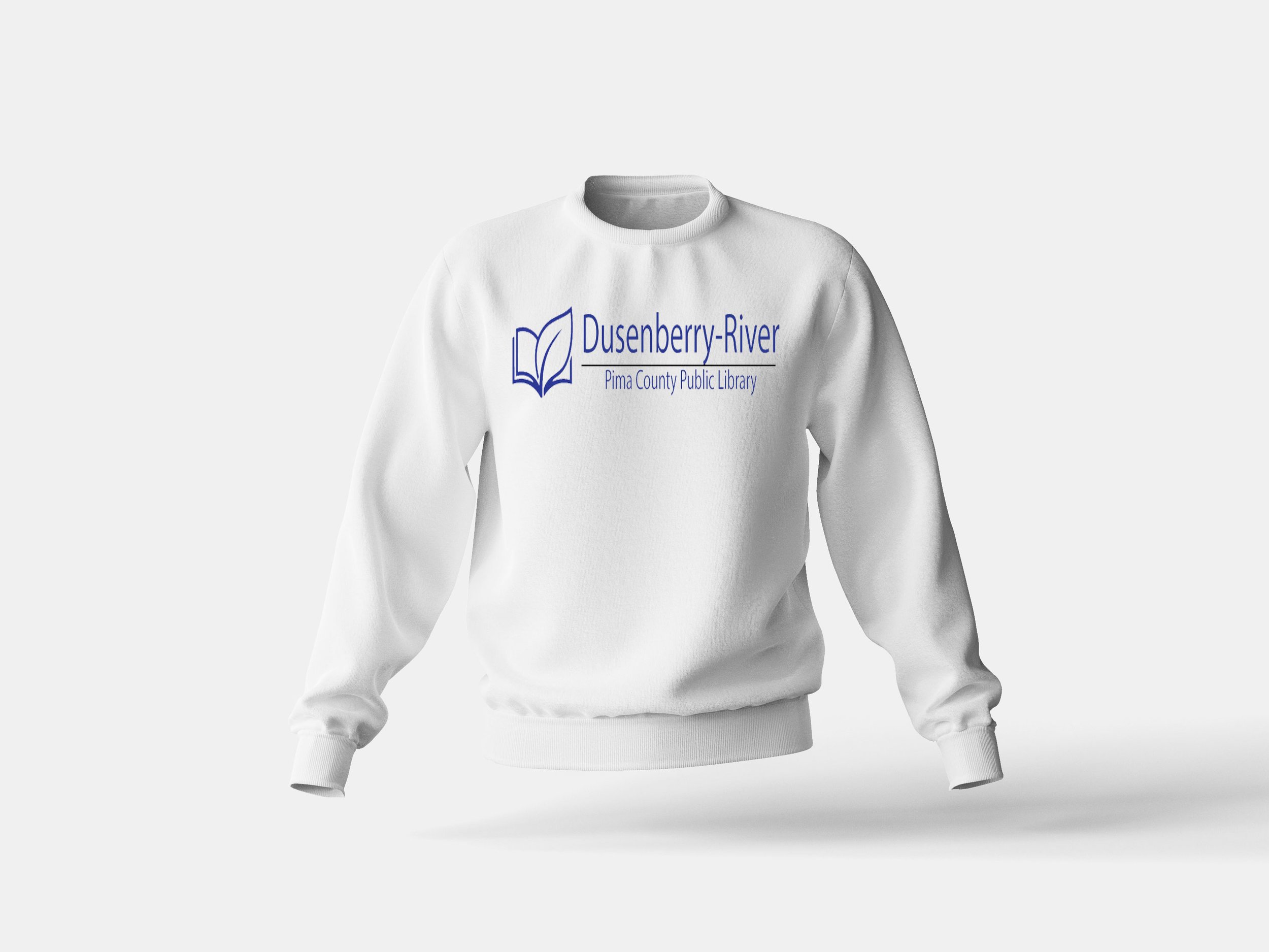
New Logo
Solutions:
Logo is clean and simple.
Dusenberry-River all on one line.
Name of library brand bigger than Pima County Public Library facillities.
Logo is a book made with a leaf to bring the nurture and learning together.
Pictograms
The pictograms were created to have vistors find the different sections faster. Also the library did not have signage to point people in the correct direction. The pictograms do use the blue from the orginial logo as well. These pictograms are temporary as I am still working on these. Will add once done.
Environmental Contact



Hex: #2b398e
RGB: 43, 57, 142
CMYK: 70, 60, 0, 44

Hex: #000000
RGB: 0, 0, 0
CMYK: 0, 0, 0, 1