
Personal Brand Identity
Tools: Adobe Illustrator, Adobe Photoshop
Personal Branding
The goal of this project was to create a personal brand that represented me as a graphic designer while communicating my personality, design style, and approach to design. I wanted the identity to feel recognizable and professional while remaining simple enough to work across different applications and platforms.
Year
2026
Research
I began by considering my personal interests, design qualities, and the characteristics I wanted my brand to communicate. I explored ideas related to my interest in nature as well as qualities such as being thoughtful, expressive, playful, and detail-oriented. I also researched and experimented with typography, color, initials, and different ways of combining my name with a visual mark.s, I wanted to keep my logo simple and not too busy.
Audience
My primary audience is potential employers and freelance clients. The identity needed to introduce me as a graphic designer and create a recognizable visual presence that could work across my portfolio, social media, business materials, and other professional applications.
Concepts
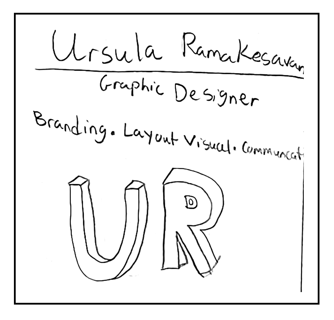
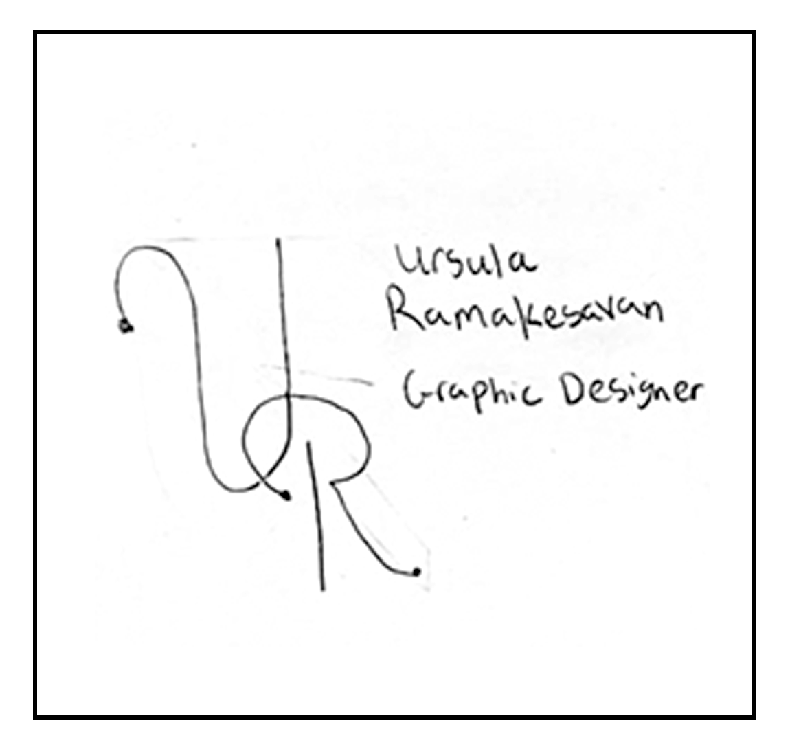
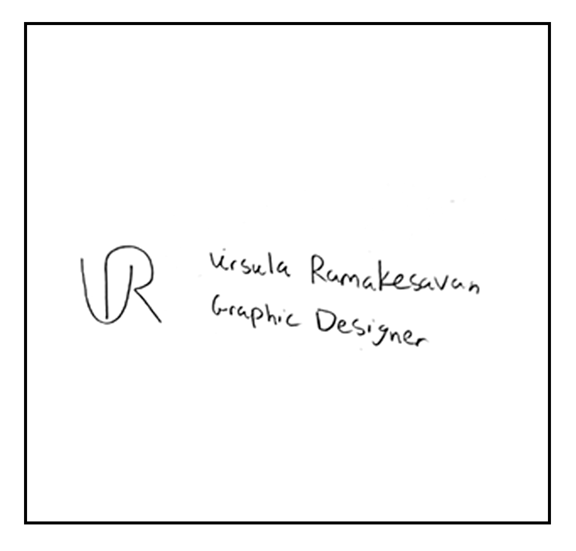
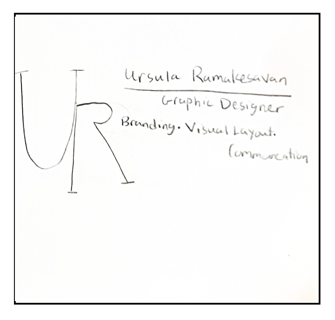
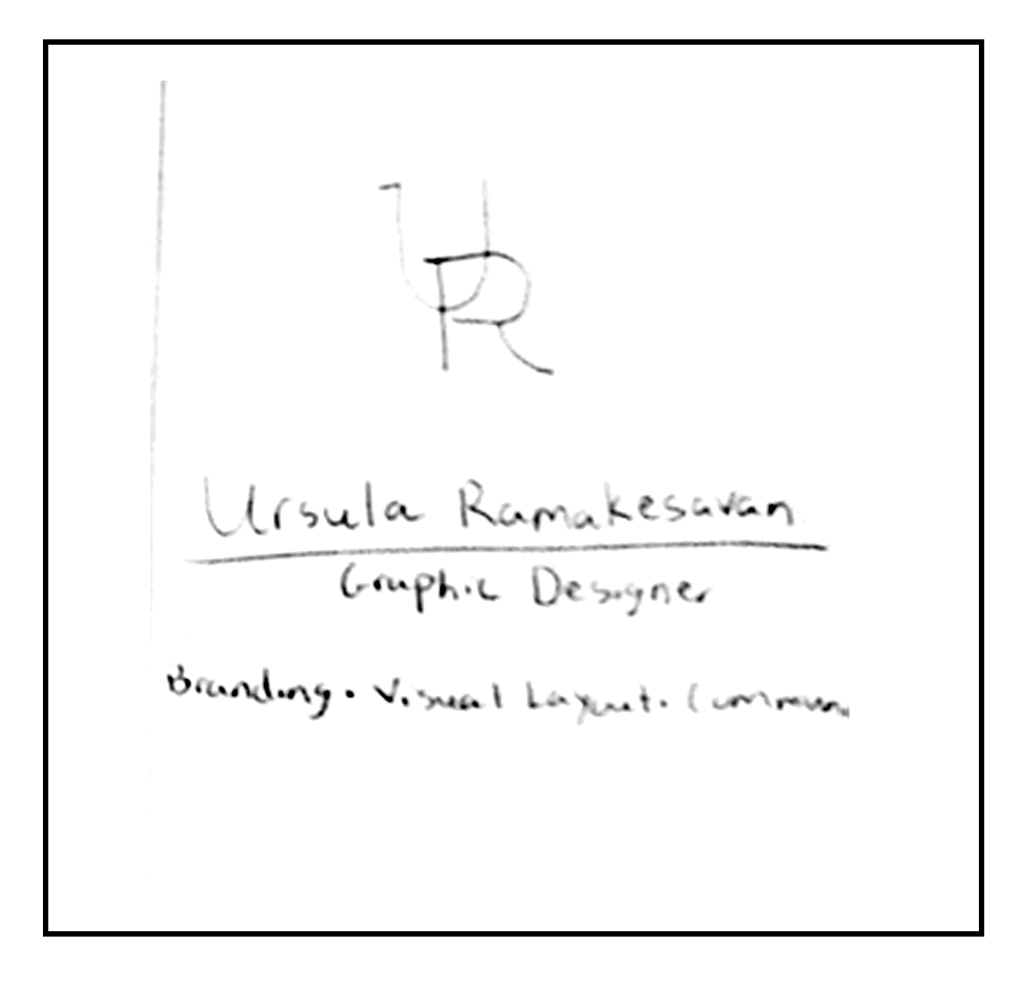
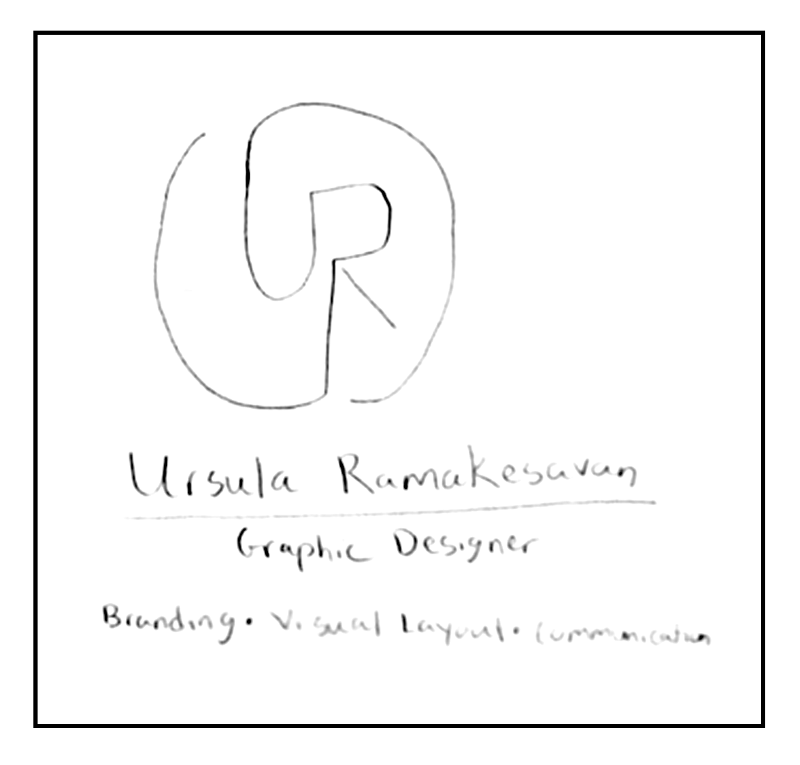
I explored several directions, including using my full name, my initials, nature-inspired elements, and a tag-inspired concept. I experimented with different arrangements of my initials and name and considered how typography and color could create a simple but distinctive identity.
Iterations
As I developed the concepts, I created different digital versions and evaluated how well each direction represented me. Some of the earlier concepts became too complicated, particularly when additional imagery was introduced. I continued refining the relationship between my initials, name, typography, and color until I found a direction that felt more focused.
Digital Iterations
Digitalizing my sketches, I tried out many different iterations for my logo. I know I wanted something that had my initials plus my full name. I also tried to bring the nature theme I wanted to try but it was not working out. I really liked the interlocking form of my initials with my full name. This made my logo have a minimal design and style to it.


Decisions
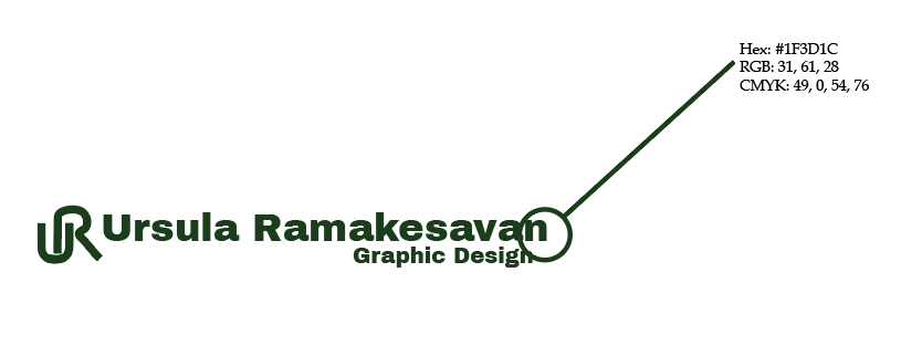
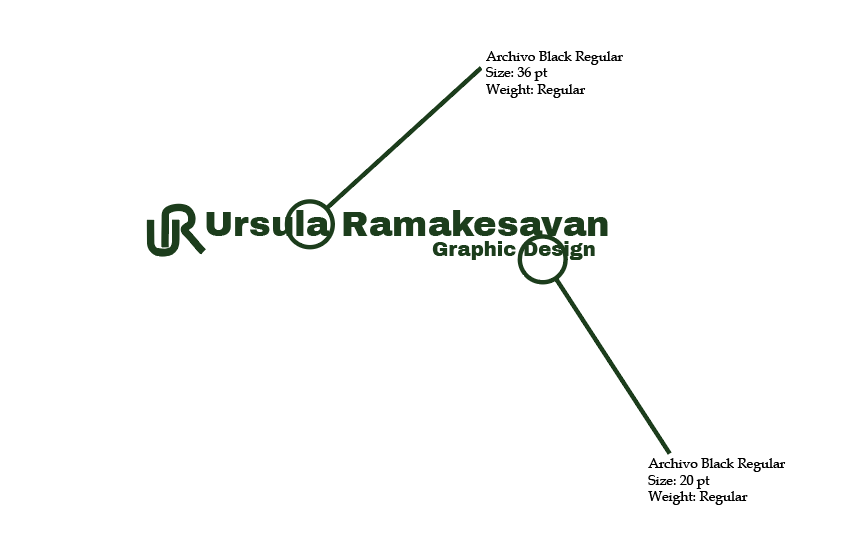
I decided to use my initials as the primary graphic element and combine them with my full name to create a recognizable identity. I chose emerald green as my primary color and used consistent typography for my name and "Graphic Design," creating hierarchy primarily through size. I also developed different logo lockups, a favicon, animation, and applications so that the identity could function as a broader visual system.
Color Palette
Starting with the white background, I wanted something that would allow the emerald green stand out. But also, keep with the minimal design of my personal branding.
Typography
The typography was to be something that was bold but still held onto the minimal design. Plus, I wanted a font that would work in emerald green. Plus, they had to be readable.
Logo Lockups and Favicon
The logo is designed to appear on many assorted products and advertisements. I also created a favicon for my website.
Final Solution
The final solution is a cohesive personal visual identity that combines my initials, name, typography, and emerald-green color palette. The system includes my primary logo, alternate lockups, favicon, animation, and applications, allowing my brand to remain consistent across different professional and digital contexts.
Final Logo
My final logo brought the minimal style to life along with using emerald green. Use just my name and initials allow to have people see who I am. I like the white background it is on, to help the color pop.
Animation
The animation was interesting to create. My initials logo is being drawn in. Starting at the halfway point of each letter and coming together as one to look like the letters are being wrapped around each other. As for my name and graphic design, I decided to have it all come in blurred but come into focus as the animation ends.
